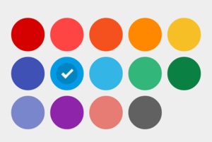
I am trying to replicate the picture above for my app, but I am very confused and don’t know how to proceed.(I’m new to android studio :/) I am trying to figure out how to know which color the user selects
So far, I have all the custom color drawable circles on my xml file but how do I know which color the user selected?(adding the check symbol) I’m thinking of putting a hidden check mark on each circle in my xml file, but only let it appear when clicked…but what would happen if the user clicked multiple colors?? I feel like there is a simpler way to approach this
I would really appreciate if someone could put me in the right direction for thinking about this, or if you could provide links that would help me learn how to do this.
Advertisement
Answer
First thing first, you would need to use RadioButton for this use case. Since the Radio buttons have inbuild mechanism of selecting only one element at a time. You can read more about RadioButtons at https://developer.android.com/guide/topics/ui/controls/radiobutton .
In case you need select mutiple colors at a time, then use Checkbox. (Read more about checkbox at https://developer.android.com/guide/topics/ui/controls/checkbox)
Now, checkbox/radio buttons can take care of selection part, now we would need to make the UI updates based on whether the color is selected or not. For this use case, we can use StateDrawable, which can change it’s UI based on the state (selected/unselected).
Following is an example of StateDrawable for checkbox/radio button:
File location: app/resources/drawables/color_picker_item.xml
<?xml version="1.0" encoding="utf-8"?>
<selector xmlns:android="http://schemas.android.com/apk/res/android">
    <item android:drawable="@drawable/check_mark_image" android:state_checked="true"/>
    <item android:drawable="@drawable/transparent" />
</selector>
The above drawable will show check_mark_image for checked state and transparent for unchecked state.
You can create this type of state drawable file for each color (this will allow to render different color checkbox based on requirement/color).
Or you can set the colors (blue, red, etc.) as background color to your checkbox and create only one state drawable file and reuse it for all based on your requirements.
You can assing this drawable to your checkbox as follow:
<CheckBox
    ...
    android:button="@drawable/color_picker_item"/>
This way you can build your color picker.